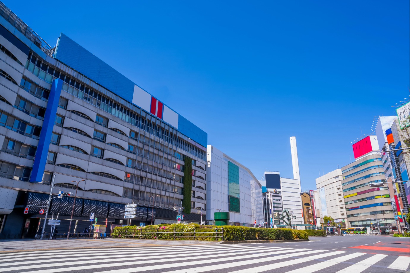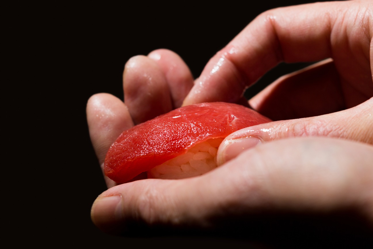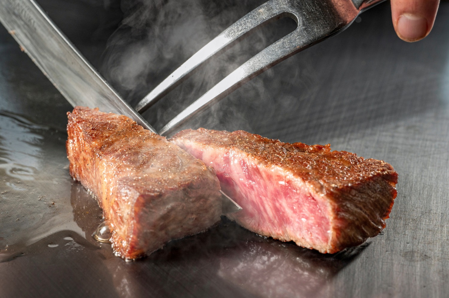
新宿區
新宿・神樂坂・高田馬場
查看新宿區
AREA GUIDE
從東京的人氣區域中,搜尋餐廳、設施與活動資訊。
EDITOR'S SELECTION
從「暢遊東京」編輯部親自造訪,並實際體驗過料理與用餐環境的店家中,依照不同主題為您精選推薦。
※刊登內容根據編輯部造訪時的資訊整理而成。
以舞蹈妝點池袋街頭的「第27屆東京YOSAKOI」 以東京・池袋為舞台,「第27屆東京YOSAKOI」即將登場。作為每年秋季舉行的豐島區民祭「ふくろ祭り」的一環,來自全國的隊伍將以原創編舞、服裝與音樂帶來震撼的演舞。 承襲源自高知縣的Yosakoi文化,東京YOSAKOI匯聚企業隊、 大學社團、在地團體、兒童隊等多元參與者,在池袋街頭盡情起舞。 東京YOSAKOI的看點 一邊漫步池袋街頭一邊欣賞演舞 會場設於池袋站西口周邊,您可以步行巡遊多個會場,盡情欣賞各隊的演舞。 依官方時間表,「車站前主會場」「アゼリア通り會場」「池袋西口公園」等均有設置。10月10日(六)的前夜祭預定於「東武百貨店スカイデッキ」,10月11日(日)的本祭亦預定設有「みずき通り會場」。 舉辦前夜祭與本祭 10月10日(六)舉行前夜祭,10月11日(日)舉行本祭。本祭中可同時欣賞一邊前進一邊起舞的「流し踊り」,以及在舞台上呈現的「舞台舞蹈」。 各會場的演舞預定於上午10點30分開始。由於各會場的出演隊伍與時間不同,請在前往前查閱官方網站的最新時間表。 觀眾也可參與的總舞 在東京YOSAKOI中,不僅舞者,觀眾也能一同參與的「總舞」亦是看點之一。伴隨現場熱度,感受池袋街區合而為一的氛圍。 推薦給這樣的人 推薦給想在池袋漫步的同時欣賞日本祭典與傳統舞蹈的您。 由於能近距離欣賞華麗的服裝、音樂與充滿力量的舞蹈,因此這是一場即使是第一次接觸日本文化的海外旅客也容易理解、容易參與的活動。 在各會場之間移動時,不妨尋找自己喜歡的隊伍或演出。 ©ふくろ祭り協議会 ©ふくろ祭り協議会 ※各會場的演出時間與內容可能有所變更。最新資訊請查看官方網站。 ※活動期間預計將實施交通管制。來場前請查看官方網站的指引。 :root { --bg-color: #fcfcfc; --card-bg: #ffffff; --text-main: #111111; --text-muted: #555555; --accent-orange: #ff5500; --accent-orange-light: #fff2ec; --border-color: #e5e5e5; --dark-card: #141414; } * { box-sizing: border-box; margin: 0; padding: 0; } html, body { width: 100%; overflow-x: hidden; background-color: var(--bg-color); color: var(--text-main); font-family: 'Noto Sans JP', 'Noto Sans', -apple-system, BlinkMacSystemFont, "Segoe UI", Roboto, "Helvetica Neue", Arial, sans-serif; line-height: 1.7; letter-spacing: 0.02em; -webkit-font-smoothing: antialiased; } .container { max-width: 860px; width: 100%; margin: 0 auto; padding: 48px 20px; } /* Header Styling */ header { border-bottom: 2px solid var(--text-main); padding-bottom: 32px; margin-bottom: 48px; } .main-title { font-size: 1.6rem; font-weight: 700; line-height: 1.35; color: var(--text-main); margin-bottom: 12px; word-break: break-word; } .intro-text { font-size: 0.925rem; color: var(--text-muted); text-align: justify; word-break: break-word; } /* Section Styling */ section { margin-bottom: 56px; width: 100%; } .section-header { margin-bottom: 24px; } .section-title { font-size: 1.3rem; font-weight: 700; letter-spacing: 0.04em; position: relative; } .section-title::after { content: ''; display: block; width: 36px; height: 3px; background-color: var(--accent-orange); margin-top: 6px; } /* Highlights Layout */ .grid-highlights { display: flex; flex-direction: column; gap: 20px; width: 100%; } .card { background-color: var(--card-bg); border: 1px solid var(--border-color); padding: 24px; width: 100%; box-sizing: border-box; transition: border-color 0.3s ease; } .card:hover { border-color: var(--accent-orange); } .card-number { font-size: 0.8rem; font-weight: 700; color: var(--accent-orange); margin-bottom: 8px; display: block; } .card-title { font-size: 1.1rem; font-weight: 700; margin-bottom: 12px; line-height: 1.4; word-break: break-word; } .card-text { font-size: 0.9rem; color: var(--text-muted); word-break: break-word; } .card-text p { margin-bottom: 8px; } .card-text p:last-child { margin-bottom: 0; } /* Recommendation Section */ .recommend-box { border-top: 1px solid var(--border-color); padding-top: 36px; width: 100%; } .recommend-text { font-size: 0.925rem; color: var(--text-main); margin-bottom: 24px; text-align: justify; word-break: break-word; } /* Image Gallery Protection & Responsiveness */ .image-gallery { display: grid; grid-template-columns: repeat(auto-fit, minmax(260px, 1fr)); gap: 20px; margin-bottom: 28px; width: 100%; -webkit-user-select: none; -moz-user-select: none; -ms-user-select: none; user-select: none; } .image-frame { background-color: #f4f4f5; border: 1px dashed var(--border-color); border-radius: 4px; padding: 12px; display: flex; flex-direction: column; align-items: center; justify-content: center; width: 100%; overflow: hidden; } .image-frame img { max-width: 100%; width: 100%; height: auto; display: block; object-fit: contain; pointer-events: none; } .image-caption { font-size: 0.75rem; color: var(--text-muted); margin-top: 8px; text-align: center; word-break: break-word; line-height: 1.4; } /* Notes List */ .notes-list { list-style: none; background-color: #f4f4f5; padding: 20px 20px 20px 32px; width: 100%; box-sizing: border-box; } .notes-list li { font-size: 0.825rem; color: var(--text-muted); margin-bottom: 6px; text-indent: -1.2em; word-break: break-word; } .notes-list li:last-child { margin-bottom: 0; } /* Responsive Design */ @media (max-width: 768px) { .main-title { font-size: 1.4rem; } .container { padding: 32px 16px; } .card { padding: 20px; } .image-gallery { grid-template-columns: 1fr; } }
連結大阪・關西世博的回憶與未來 「EXPO2025 Futures Tour」東京 在回顧大阪・關西世博的魅力與回憶之際,介紹從世博孕育出的「未來的延續」的全國巡迴活動「EXPO2025 Futures Tour」,將於東京・麻布台Hills Arena舉行。 會場將帶來多樣內容,讓您重溫世博記憶,包括運用大屋頂環邊角料創作的藝術作品、以照片回顧大阪・關西世博的展館,以及介紹184天世博足跡的「Futures Diary」等。 活動亮點 回顧世博的多元展出 展區中將展出與大阪・關西世博官方角色「ミャクミャク」相關的內容,並介紹由大屋頂環邊角料誕生的藝術作品等。 可觸摸大屋頂環的柱與樑實物的「Futures Piece Project -TOUCH-」,以及以照片回顧國內外展館的「Co-Creation Pavilion」等,讓您從多角度享受世博。 以煙火表現對未來的訊息 「Futures Message HANABI」中,將把源自大阪・關西世博展覽與建築的「未來的延續」以仿若煙火的形式進行介紹。 此外,參加者也可將面向未來的想法與願望寫在訊息卡上,貼到「FUTURES HANABI WALL」,或透過會場的QR碼投稿訊息。 舞台上將有對談與ミャクミャク登場 10月10日(六)將舉辦由大阪・關西世博主題事業製作人中島さち子女士帶來的「Signature Session」,以及ミャクミャク登場的舞台活動。 10月11日(日)則有ミャクミャク的創作者、設計師兼繪本作家山下浩平先生登台,並舉行東京會場限定的「ミャクミャクFutures Stage」。 此外,亦預定舉辦「GREEN×EXPO 2027 特別舞台」。 推薦給這樣的您 本活動不僅推薦給曾造訪大阪・關西世博的您,也適合想在東京感受世博氛圍,或想欣賞以未來為主題的展覽與藝術的朋友。 亦備有東京會場限定的內容,如可透過VR眼鏡體驗世博展館的「EXPO 2025 360°劇場」,以及可一邊巡遊會場一邊享受的「Futures SPECIAL STAMP」等。 不妨在回味世博的記憶之際,體驗由此孕育而生的全新「未來」。 圖片提供:2025年日本国際博覧会協会 圖片提供:2025年日本国際博覧会協会 ※展區與舞台區的事前抽選申請受理已結束。 ※部分內容需當日先到先得發放的整理券。 ※展區預計於16:00之後開放自由入場,無需整理券。 ※活動內容與講者可能會有所變更。 :root { --bg-color: #fcfcfc; --card-bg: #ffffff; --text-main: #111111; --text-muted: #555555; --accent-orange: #ff5500; --accent-orange-light: #fff2ec; --border-color: #e5e5e5; --dark-card: #141414; } * { box-sizing: border-box; margin: 0; padding: 0; } html, body { width: 100%; overflow-x: hidden; background-color: var(--bg-color); color: var(--text-main); font-family: 'Noto Sans JP', 'Noto Sans', -apple-system, BlinkMacSystemFont, "Segoe UI", Roboto, "Helvetica Neue", Arial, sans-serif; line-height: 1.7; letter-spacing: 0.02em; -webkit-font-smoothing: antialiased; } .container { max-width: 860px; width: 100%; margin: 0 auto; padding: 48px 20px; } /* Header Styling */ header { border-bottom: 2px solid var(--text-main); padding-bottom: 32px; margin-bottom: 48px; } .badge { display: inline-block; background-color: var(--accent-orange); color: #ffffff; font-size: 0.75rem; font-weight: 700; padding: 3px 10px; text-transform: uppercase; letter-spacing: 0.08em; margin-bottom: 16px; } .main-title { font-size: 1.6rem; font-weight: 700; line-height: 1.35; color: var(--text-main); margin-bottom: 12px; word-break: break-word; } .intro-text { font-size: 0.925rem; color: var(--text-muted); text-align: justify; word-break: break-word; } /* Section Styling */ section { margin-bottom: 56px; width: 100%; } .section-header { margin-bottom: 24px; } .section-title { font-size: 1.3rem; font-weight: 700; letter-spacing: 0.04em; position: relative; } .section-title::after { content: ''; display: block; width: 36px; height: 3px; background-color: var(--accent-orange); margin-top: 6px; } /* Highlights Layout */ .grid-highlights { display: flex; flex-direction: column; gap: 20px; width: 100%; } .card { background-color: var(--card-bg); border: 1px solid var(--border-color); padding: 24px; width: 100%; box-sizing: border-box; transition: border-color 0.3s ease; } .card:hover { border-color: var(--accent-orange); } .card-number { font-size: 0.8rem; font-weight: 700; color: var(--accent-orange); margin-bottom: 8px; display: block; } .card-title { font-size: 1.1rem; font-weight: 700; margin-bottom: 12px; line-height: 1.4; word-break: break-word; } .card-text { font-size: 0.9rem; color: var(--text-muted); word-break: break-word; } .card-text p { margin-bottom: 8px; } .card-text p:last-child { margin-bottom: 0; } /* Recommendation Section */ .recommend-box { border-top: 1px solid var(--border-color); padding-top: 36px; width: 100%; } .recommend-text { font-size: 0.925rem; color: var(--text-main); margin-bottom: 24px; text-align: justify; word-break: break-word; } /* Image Gallery Protection & Responsiveness */ .image-gallery { display: grid; grid-template-columns: repeat(auto-fit, minmax(260px, 1fr)); gap: 20px; margin-bottom: 28px; width: 100%; -webkit-user-select: none; -moz-user-select: none; -ms-user-select: none; user-select: none; } .image-frame { background-color: #f4f4f5; border: 1px dashed var(--border-color); border-radius: 4px; padding: 12px; display: flex; flex-direction: column; align-items: center; justify-content: center; width: 100%; overflow: hidden; } .image-frame img { max-width: 100%; width: 100%; height: auto; display: block; object-fit: contain; pointer-events: none; } .image-caption { font-size: 0.75rem; color: var(--text-muted); margin-top: 8px; text-align: center; word-break: break-word; line-height: 1.4; } /* Notes List */ .notes-list { list-style: none; background-color: #f4f4f5; padding: 20px 20px 20px 32px; width: 100%; box-sizing: border-box; } .notes-list li { font-size: 0.825rem; color: var(--text-muted); margin-bottom: 6px; text-indent: -1.2em; word-break: break-word; } .notes-list li:last-child { margin-bottom: 0; } /* Responsive Design */ @media (max-width: 768px) { .main-title { font-size: 1.4rem; } .container { padding: 32px 16px; } .card { padding: 20px; } .image-gallery { grid-template-columns: 1fr; } }
以音樂、舞蹈與藝術連結的活動 「WILDチャンプルー」 「WILDチャンプルー」將於2026年10月11日(星期日),在東京都中野區的中野區四季之森公園活動區域舉辦。 本活動透過街舞、音樂與藝術,促成跨世代、跨立場的交流。從孩子到大人,不論經驗或頭銜,皆以打造人人都能自在表現自我的場域為目標。 活動亮點 自由參與的 Freestyle 舞蹈 會場設有 Freestyle 舞蹈的 Cypher 區域,大家可自由加入盡情起舞。隨著音樂節奏律動,與各式各樣的人交流互動,正是其魅力所在。 塗鴉繪畫工作坊 13:00~15:00 將舉辦以「大家一起來畫畫!」為主題的塗鴉工作坊。透過繪畫的樂趣,挑戰屬於自己的表達方式。 另提醒,所使用的壓克力顏料一旦沾到衣物不易清洗,建議穿著不怕弄髒的衣物參加。 推薦給這樣的你 不僅適合對街頭文化、舞蹈、藝術有興趣的你,也推薦給正在尋找能與家人、朋友輕鬆參與的活動的人。 不分年齡與經驗,一邊享受各自的個性,一邊感受人與人之間的連結,度過美好的一天,何不來親身體驗看看? ※最新消息與詳細時程請參閱官方網站。 ※參加工作坊時請穿著不怕弄髒的衣物前來。 :root { --bg-color: #fcfcfc; --card-bg: #ffffff; --text-main: #111111; --text-muted: #555555; --accent-orange: #ff5500; --accent-orange-light: #fff2ec; --border-color: #e5e5e5; --dark-card: #141414; } * { box-sizing: border-box; margin: 0; padding: 0; } html, body { width: 100%; overflow-x: hidden; background-color: var(--bg-color); color: var(--text-main); font-family: 'Noto Sans JP', 'Noto Sans', -apple-system, BlinkMacSystemFont, "Segoe UI", Roboto, "Helvetica Neue", Arial, sans-serif; line-height: 1.7; letter-spacing: 0.02em; -webkit-font-smoothing: antialiased; } .container { max-width: 860px; width: 100%; margin: 0 auto; padding: 48px 20px; } /* Header Styling */ header { border-bottom: 2px solid var(--text-main); padding-bottom: 32px; margin-bottom: 48px; } .badge { display: inline-block; background-color: var(--accent-orange); color: #ffffff; font-size: 0.75rem; font-weight: 700; padding: 3px 10px; text-transform: uppercase; letter-spacing: 0.08em; margin-bottom: 16px; } .main-title { font-size: 1.6rem; font-weight: 700; line-height: 1.35; color: var(--text-main); margin-bottom: 12px; word-break: break-word; } .intro-text { font-size: 0.925rem; color: var(--text-muted); text-align: justify; word-break: break-word; } /* Section Styling */ section { margin-bottom: 56px; width: 100%; } .section-header { margin-bottom: 24px; } .section-title { font-size: 1.3rem; font-weight: 700; letter-spacing: 0.04em; position: relative; } .section-title::after { content: ''; display: block; width: 36px; height: 3px; background-color: var(--accent-orange); margin-top: 6px; } /* Highlights Layout */ .grid-highlights { display: flex; flex-direction: column; gap: 20px; width: 100%; } .card { background-color: var(--card-bg); border: 1px solid var(--border-color); padding: 24px; width: 100%; box-sizing: border-box; transition: border-color 0.3s ease; } .card:hover { border-color: var(--accent-orange); } .card-number { font-size: 0.8rem; font-weight: 700; color: var(--accent-orange); margin-bottom: 8px; display: block; } .card-title { font-size: 1.1rem; font-weight: 700; margin-bottom: 12px; line-height: 1.4; word-break: break-word; } .card-text { font-size: 0.9rem; color: var(--text-muted); word-break: break-word; } .card-text p { margin-bottom: 8px; } .card-text p:last-child { margin-bottom: 0; } /* Recommendation Section */ .recommend-box { border-top: 1px solid var(--border-color); padding-top: 36px; width: 100%; } .recommend-text { font-size: 0.925rem; color: var(--text-main); margin-bottom: 24px; text-align: justify; word-break: break-word; } /* Image Gallery Protection & Responsiveness */ .image-gallery { display: grid; grid-template-columns: repeat(auto-fit, minmax(260px, 1fr)); gap: 20px; margin-bottom: 28px; width: 100%; -webkit-user-select: none; -moz-user-select: none; -ms-user-select: none; user-select: none; } .image-frame { background-color: #f4f4f5; border: 1px dashed var(--border-color); border-radius: 4px; padding: 12px; display: flex; flex-direction: column; align-items: center; justify-content: center; width: 100%; overflow: hidden; } .image-frame img { max-width: 100%; width: 100%; height: auto; display: block; object-fit: contain; pointer-events: none; } .image-caption { font-size: 0.75rem; color: var(--text-muted); margin-top: 8px; text-align: center; word-break: break-word; line-height: 1.4; } /* Notes List */ .notes-list { list-style: none; background-color: #f4f4f5; padding: 20px 20px 20px 32px; width: 100%; box-sizing: border-box; } .notes-list li { font-size: 0.825rem; color: var(--text-muted); margin-bottom: 6px; text-indent: -1.2em; word-break: break-word; } .notes-list li:last-child { margin-bottom: 0; } /* Responsive Design */ @media (max-width: 768px) { .main-title { font-size: 1.4rem; } .container { padding: 32px 16px; } .card { padding: 20px; } .image-gallery { grid-template-columns: 1fr; } }
特展 國立科學博物館 特展「いきもの超ワールド展 国立科学博物館×ダーウィンが来た!」現正舉辦 聚焦在適應地球環境變化而進化的生物之「驚人的能力」與「生存策略」 國立科學博物館正舉辦特展「いきもの超ワールド展 国立科学博物館×ダーウィンが来た!」。 本展聚焦於生物在適應地球環境變化過程中所形成的「驚人能力」與「生存策略」。除國立科學博物館所藏的標本、資料與研究成果外,亦透過NHK自然節目『ダーウィンが来た!』拍攝的影像,介紹生物多樣的演化與生態。 展覽亮點 POINT 01 透過標本・研究・影像學習生物的演化 展覽將依主題介紹適應各種環境的生物性狀與功能。 透過實體標本、最新研究成果與珍貴的自然影像,輕鬆學習動物如何適應環境並延續生命。 POINT 02 與『ダーウィンが来た!』的聯合企劃 透過與NHK自然節目『ダーウィンが来た!』的聯合企劃,展出節目製作團隊所拍攝的影像。 本展原創角色「くじらじい」源自與在『ダーウィンが来た!』中廣為人知的「ヒゲじい」之合作。在介紹標本、研究與影像亮點的同時,深入探索生物的奧秘。 POINT 03 也能享受語音導覽 語音導覽由本展導覽員相葉雅紀、「くじらじい」以及「ヒゲじい」登場。 會場租借版每台650日圓(含稅),App配信版為800日圓(含稅)。推薦給想更深入欣賞展覽的觀眾。 推薦給家庭旅遊與上野的美術館・博物館巡禮 本展可透過標本與影像兩種方式欣賞生物驚人的生態,適合從兒童到成人的各個年齡層。 會場位於上野公園內的國立科學博物館。不妨與上野地區的博物館、美術館巡禮一併安排造訪。 圖片提供:いきもの超ワールド展 圖片提供:いきもの超ワールド展 ※本展的觀眾可於同日參觀常設展,但僅限於常設展的開館時間內。 ※展出內容、展期、開館日與開館時間等可能會有所變更。 :root { --bg-color: #fcfcfc; --card-bg: #ffffff; --text-main: #111111; --text-muted: #555555; --accent-orange: #ff5500; --accent-orange-light: #fff2ec; --border-color: #e5e5e5; --dark-card: #141414; } * { box-sizing: border-box; margin: 0; padding: 0; } html, body { width: 100%; overflow-x: hidden; } body { background-color: var(--bg-color); color: var(--text-main); font-family: 'Noto Sans JP', 'Noto Sans', -apple-system, BlinkMacSystemFont, "Segoe UI", Roboto, "Helvetica Neue", Arial, sans-serif; line-height: 1.7; letter-spacing: 0.02em; -webkit-font-smoothing: antialiased; } .container { max-width: 860px; width: 100%; margin: 0 auto; padding: 48px 20px; } /* Header Styling */ header { border-bottom: 2px solid var(--text-main); padding-bottom: 32px; margin-bottom: 48px; } .badge { display: inline-block; background-color: var(--accent-orange); color: #ffffff; font-size: 0.75rem; font-weight: 700; padding: 3px 10px; text-transform: uppercase; letter-spacing: 0.08em; margin-bottom: 16px; } .main-title { font-size: 1.6rem; font-weight: 700; line-height: 1.35; color: var(--text-main); margin-bottom: 12px; word-break: break-word; } .subtitle { font-size: 1rem; font-weight: 500; color: var(--accent-orange); margin-bottom: 24px; word-break: break-word; } .intro-text { font-size: 0.925rem; color: var(--text-muted); text-align: justify; word-break: break-word; } /* Section Styling */ section { margin-bottom: 56px; width: 100%; } .section-header { margin-bottom: 24px; } .section-title { font-size: 1.3rem; font-weight: 700; letter-spacing: 0.04em; position: relative; } .section-title::after { content: ''; display: block; width: 36px; height: 3px; background-color: var(--accent-orange); margin-top: 6px; } /* Highlights Layout */ .grid-highlights { display: flex; flex-direction: column; gap: 20px; width: 100%; } .card { background-color: var(--card-bg); border: 1px solid var(--border-color); padding: 24px; width: 100%; box-sizing: border-box; transition: border-color 0.3s ease; } .card:hover { border-color: var(--accent-orange); } .card-number { font-size: 0.8rem; font-weight: 700; color: var(--accent-orange); margin-bottom: 8px; display: block; } .card-title { font-size: 1.05rem; font-weight: 700; margin-bottom: 12px; line-height: 1.4; word-break: break-word; } .card-text { font-size: 0.9rem; color: var(--text-muted); text-align: justify; word-break: break-word; } /* Recommendation Section */ .recommend-box { border-top: 1px solid var(--border-color); padding-top: 36px; width: 100%; } .recommend-text { font-size: 0.925rem; color: var(--text-main); margin-bottom: 24px; text-align: justify; word-break: break-word; } /* Image Gallery */ .image-gallery { display: grid; grid-template-columns: repeat(auto-fit, minmax(260px, 1fr)); gap: 20px; margin-bottom: 28px; width: 100%; } .image-frame { background-color: #f4f4f5; border: 1px dashed var(--border-color); border-radius: 4px; padding: 12px; display: flex; flex-direction: column; align-items: center; justify-content: center; width: 100%; overflow: hidden; } .image-frame img { max-width: 100%; height: auto; display: block; object-fit: contain; /* Chống kéo thả hình ảnh */ pointer-events: none; -webkit-user-drag: none; -webkit-user-select: none; user-select: none; } .image-caption { font-size: 0.75rem; color: var(--text-muted); margin-top: 8px; text-align: center; word-break: break-word; line-height: 1.4; } /* Notes List */ .notes-list { list-style: none; background-color: #f4f4f5; padding: 20px 20px 20px 32px; width: 100%; box-sizing: border-box; } .notes-list li { font-size: 0.825rem; color: var(--text-muted); margin-bottom: 6px; text-indent: -1.2em; word-break: break-word; } .notes-list li:last-child { margin-bottom: 0; } /* Responsive Design */ @media (max-width: 768px) { .main-title { font-size: 1.4rem; } .subtitle { font-size: 0.95rem; } .container { padding: 32px 16px; } .card { padding: 20px; } .image-gallery { grid-template-columns: 1fr; } } document.addEventListener('contextmenu', function(e) { if (e.target.tagName === 'IMG') { e.preventDefault(); } });
BUSINESS
為您介紹Gurutto Tokyo收錄的企業。

FOR BUSINESS OWNERS
從精心製作展現店家魅力的頁面,到多語言服務、在地搜尋最佳化及評論管理,Gurutto Tokyo全面支援您的資訊傳播與來客推廣。
為訪日旅客提供英語、中文、韓語、越南語等多語言網站。
Cookie🍪 與隱私
本網站使用 Cookie 與 Google Tag Manager 來分析使用情況並提升服務。您可選擇允許或拒絕非必要的 Cookie。詳情請參閱 隱私權政策。