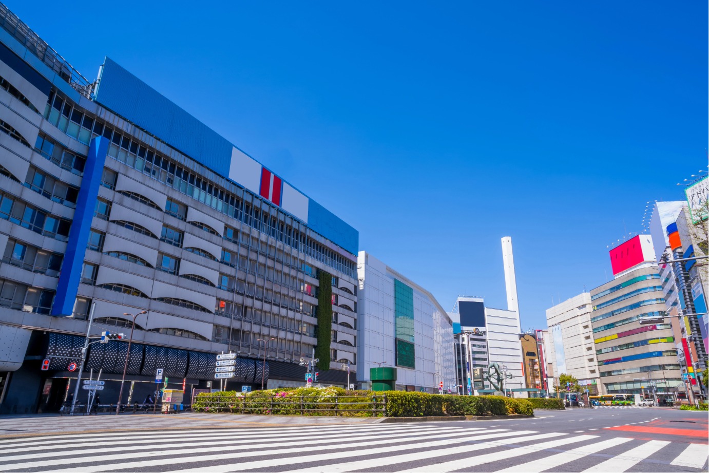
新宿區
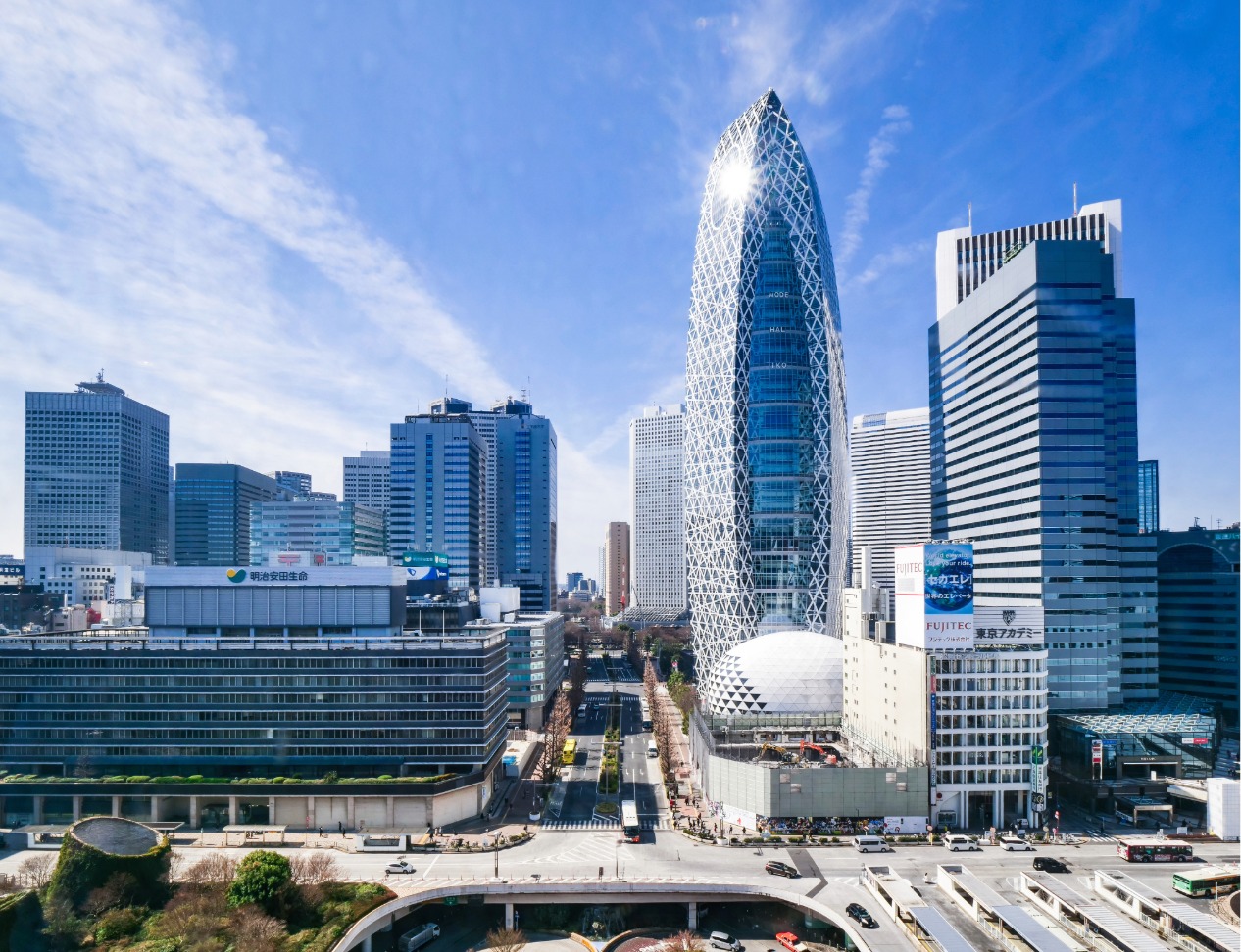
新宿・神樂坂・高田馬場
查看新宿區
AREA GUIDE
從東京的人氣區域中,搜尋餐廳、設施與活動資訊。
EDITOR'S SELECTION
從「暢遊東京」編輯部親自造訪,並實際體驗過料理與用餐環境的店家中,依照不同主題為您精選推薦。
※刊登內容根據編輯部造訪時的資訊整理而成。
池上本門寺 御會式 在日蓮宗大本山・池上本門寺,將舉辦以日蓮聖人的忌日為中心的法要活動「御會式(おえしき)」。2026年適逢宗祖第七百四十五遠忌。 包括法要與法話在內,還有為池上街區增添色彩的「萬燈練供養」、追思日蓮聖人入滅的「臨滅度時法要」等。在與日蓮聖人有淵源的靈跡,正是體驗傳統佛教行事的良機。 御會式的看點 漫步池上街區的萬燈練供養 10月12日,將從池上德持會館到池上本門寺,舉行長達約2公里的萬燈練行列。 來自全國各地的講中將抬著上百座萬燈,伴隨著纏、團扇太鼓、鉦、笛的聲音,穿行於池上的街道。以紙製花卉裝飾的萬燈,源自於據傳日蓮聖人入滅之際,庭前的櫻花逆季綻放的故事。 莊嚴肅穆的臨滅度時法要 10月13日早上7點起,將舉行「特別說法・臨滅度時法要」。 仿效據傳於日蓮聖人入滅之時,由日昭聖人所擊響之鐘,池上本門寺的貫首將安靜地擊打「臨滅度時之鐘」。 法要・法話與團體參拜 御會式期間,將舉行各式各樣的法要與法話。10月12日上午10點,舉行將日蓮聖人的御衣由夏裝更換為冬裝的「宗祖御更衣法要」,下午2點則舉行「宗祖報恩御逮夜法要」。 此外,自12日起,大堂回響著題目的聲音,來自全國的大批參詣者與團體參拜者紛至沓來。 亦有直播 萬燈練供養與臨滅度時法要預計將於網路進行直播。無法親臨現場者也可透過官方網站觀看行事的情況。 參拜時的注意事項 於御會式期間,池上本門寺與池上車站周邊將實施交通管制。除了對汽車的進出與通行加以限制外,也建議避免騎自行車前往參拜。 此外,在本門寺境內以及萬燈練行列區域,禁止使用無人機等以無線操作之飛行物。由於交通管制與引導內容可能變更,請遵從當地警察與引導人員的指示。 各式萬燈 © 池上本門寺 纏 © 池上本門寺 ※關於行事時間、交通管制、直播等詳細資訊,請於來訪前查閱官方網站。 ※目前配合日蓮大聖人第750遠忌事業,正進行大堂的修繕工程。 :root { --bg-color: #fcfcfc; --card-bg: #ffffff; --text-main: #111111; --text-muted: #555555; --accent-orange: #ff5500; --accent-orange-light: #fff2ec; --border-color: #e5e5e5; --dark-card: #141414; } * { box-sizing: border-box; margin: 0; padding: 0; } html, body { width: 100%; overflow-x: hidden; background-color: var(--bg-color); color: var(--text-main); font-family: 'Noto Sans JP', 'Noto Sans', -apple-system, BlinkMacSystemFont, "Segoe UI", Roboto, "Helvetica Neue", Arial, sans-serif; line-height: 1.7; letter-spacing: 0.02em; -webkit-font-smoothing: antialiased; } .container { max-width: 860px; width: 100%; margin: 0 auto; padding: 48px 20px; } /* Header Styling */ header { border-bottom: 2px solid var(--text-main); padding-bottom: 32px; margin-bottom: 48px; } .badge { display: inline-block; background-color: var(--accent-orange); color: #ffffff; font-size: 0.75rem; font-weight: 700; padding: 3px 10px; text-transform: uppercase; letter-spacing: 0.08em; margin-bottom: 16px; } .main-title { font-size: 1.6rem; font-weight: 700; line-height: 1.35; color: var(--text-main); margin-bottom: 12px; word-break: break-word; } .intro-text { font-size: 0.925rem; color: var(--text-muted); text-align: justify; word-break: break-word; } /* Section Styling */ section { margin-bottom: 56px; width: 100%; } .section-header { margin-bottom: 24px; } .section-title { font-size: 1.3rem; font-weight: 700; letter-spacing: 0.04em; position: relative; } .section-title::after { content: ''; display: block; width: 36px; height: 3px; background-color: var(--accent-orange); margin-top: 6px; } /* Highlights Layout */ .grid-highlights { display: flex; flex-direction: column; gap: 20px; width: 100%; } .card { background-color: var(--card-bg); border: 1px solid var(--border-color); padding: 24px; width: 100%; box-sizing: border-box; transition: border-color 0.3s ease; } .card:hover { border-color: var(--accent-orange); } .card-number { font-size: 0.8rem; font-weight: 700; color: var(--accent-orange); margin-bottom: 8px; display: block; } .card-title { font-size: 1.1rem; font-weight: 700; margin-bottom: 12px; line-height: 1.4; word-break: break-word; } .card-text { font-size: 0.9rem; color: var(--text-muted); word-break: break-word; } .card-text p { margin-bottom: 8px; } .card-text p:last-child { margin-bottom: 0; } /* Recommendation Section */ .recommend-box { border-top: 1px solid var(--border-color); padding-top: 36px; width: 100%; } .recommend-text { font-size: 0.925rem; color: var(--text-main); margin-bottom: 24px; text-align: justify; word-break: break-word; } /* Image Gallery Protection & Responsiveness */ .image-gallery { display: grid; grid-template-columns: repeat(auto-fit, minmax(260px, 1fr)); gap: 20px; margin-bottom: 28px; width: 100%; -webkit-user-select: none; -moz-user-select: none; -ms-user-select: none; user-select: none; } .image-frame { background-color: #f4f4f5; border: 1px dashed var(--border-color); border-radius: 4px; padding: 12px; display: flex; flex-direction: column; align-items: center; justify-content: center; width: 100%; overflow: hidden; } .image-frame img { max-width: 100%; width: 100%; height: auto; display: block; object-fit: contain; pointer-events: none; } .image-caption { font-size: 0.75rem; color: var(--text-muted); margin-top: 8px; text-align: center; word-break: break-word; line-height: 1.4; } /* Notes List */ .notes-list { list-style: none; background-color: #f4f4f5; padding: 20px 20px 20px 32px; width: 100%; box-sizing: border-box; } .notes-list li { font-size: 0.825rem; color: var(--text-muted); margin-bottom: 6px; text-indent: -1.2em; word-break: break-word; } .notes-list li:last-child { margin-bottom: 0; } /* Responsive Design */ @media (max-width: 768px) { .main-title { font-size: 1.4rem; } .container { padding: 32px 16px; } .card { padding: 20px; } .image-gallery { grid-template-columns: 1fr; } }
開創700年紀念 特別展「大徳寺 本朝無双之禅苑」 為紀念位於京都・紫野的大德寺開創700年,特別展「大徳寺 本朝無双之禅苑」將在東京國立博物館 平成館舉行。 自1326年開山以來,大德寺與歷代名僧、天皇、戰國武將與茶人保持著深厚的關係並不斷發展。本展將把包含塔頭與大德寺派寺院在內的大德寺山內寺寶齊聚一堂,介紹長達700年的歷史與文化。 展覽亮點 公開國寶14件、重要文化財69件 匯集大德寺寶物的展覽相隔41年再度舉辦,且於東京尚屬首次。 將展出包括國寶「観音猿鶴図」、重要文化財「龍虎図」、以及宗峰妙超筆的國寶「看読真詮榜」等,傳遞禪與美術歷史的珍貴作品。 作品將於前期、後期進行部分更換。前期為10月14日(週三)至11月8日(週日),後期為11月10日(週二)至12月6日(週日)。 再現展示平時不公開的三門 會場將再現展示大德寺平時不對外公開的三門。 安置於三門的本尊「釋迦如來坐像」,以及首次公開的「千利休立像」也將於全期間展出。這是能夠感受大德寺與禪、茶之湯連結的展示。 與大德寺淵源深厚的人物與700年的歷史 也將介紹與大德寺關係密切的人物相關作品,如一休宗純、後醍醐天皇、織田信長、豐臣秀吉等。 透過歷代名僧、權力者與茶人對大德寺的信仰與關聯,可以追溯日本禪文化所走過的歷程。 推薦給這樣的您 這場展覽不僅適合對禪與日本美術有興趣的人,也推薦給關心京都寺院文化與茶道歷史的人士。 不妨在東京國立博物館,親身感受大德寺所傳承的七百年之美與精神。 ※展出作品、展期、開館時間、休館日、入館方式等可能有所變更。來館前請至官方網站確認最新資訊。 :root { --bg-color: #fcfcfc; --card-bg: #ffffff; --text-main: #111111; --text-muted: #555555; --accent-orange: #ff5500; --accent-orange-light: #fff2ec; --border-color: #e5e5e5; --dark-card: #141414; } * { box-sizing: border-box; margin: 0; padding: 0; } html, body { width: 100%; overflow-x: hidden; background-color: var(--bg-color); color: var(--text-main); font-family: 'Noto Sans JP', 'Noto Sans', -apple-system, BlinkMacSystemFont, "Segoe UI", Roboto, "Helvetica Neue", Arial, sans-serif; line-height: 1.7; letter-spacing: 0.02em; -webkit-font-smoothing: antialiased; } .container { max-width: 860px; width: 100%; margin: 0 auto; padding: 48px 20px; } /* Header Styling */ header { border-bottom: 2px solid var(--text-main); padding-bottom: 32px; margin-bottom: 48px; } .badge { display: inline-block; background-color: var(--accent-orange); color: #ffffff; font-size: 0.75rem; font-weight: 700; padding: 3px 10px; text-transform: uppercase; letter-spacing: 0.08em; margin-bottom: 16px; } .main-title { font-size: 1.6rem; font-weight: 700; line-height: 1.35; color: var(--text-main); margin-bottom: 12px; word-break: break-word; } .intro-text { font-size: 0.925rem; color: var(--text-muted); text-align: justify; word-break: break-word; } /* Section Styling */ section { margin-bottom: 56px; width: 100%; } .section-header { margin-bottom: 24px; } .section-title { font-size: 1.3rem; font-weight: 700; letter-spacing: 0.04em; position: relative; } .section-title::after { content: ''; display: block; width: 36px; height: 3px; background-color: var(--accent-orange); margin-top: 6px; } /* Highlights Layout */ .grid-highlights { display: flex; flex-direction: column; gap: 20px; width: 100%; } .card { background-color: var(--card-bg); border: 1px solid var(--border-color); padding: 24px; width: 100%; box-sizing: border-box; transition: border-color 0.3s ease; } .card:hover { border-color: var(--accent-orange); } .card-number { font-size: 0.8rem; font-weight: 700; color: var(--accent-orange); margin-bottom: 8px; display: block; } .card-title { font-size: 1.1rem; font-weight: 700; margin-bottom: 12px; line-height: 1.4; word-break: break-word; } .card-text { font-size: 0.9rem; color: var(--text-muted); word-break: break-word; } .card-text p { margin-bottom: 8px; } .card-text p:last-child { margin-bottom: 0; } /* Recommendation Section */ .recommend-box { border-top: 1px solid var(--border-color); padding-top: 36px; width: 100%; } .recommend-text { font-size: 0.925rem; color: var(--text-main); margin-bottom: 24px; text-align: justify; word-break: break-word; } /* Image Gallery Protection & Responsiveness */ .image-gallery { display: grid; grid-template-columns: repeat(auto-fit, minmax(260px, 1fr)); gap: 20px; margin-bottom: 28px; width: 100%; /* Copy protection for images */ -webkit-user-select: none; -moz-user-select: none; -ms-user-select: none; user-select: none; } .image-frame { background-color: #f4f4f5; border: 1px dashed var(--border-color); border-radius: 4px; padding: 12px; display: flex; flex-direction: column; align-items: center; justify-content: center; width: 100%; overflow: hidden; } .image-frame img { max-width: 100%; width: 100%; height: auto; display: block; object-fit: contain; pointer-events: none; } .image-caption { font-size: 0.75rem; color: var(--text-muted); margin-top: 8px; text-align: center; word-break: break-word; line-height: 1.4; } /* Notes List */ .notes-list { list-style: none; background-color: #f4f4f5; padding: 20px 20px 20px 32px; width: 100%; box-sizing: border-box; } .notes-list li { font-size: 0.825rem; color: var(--text-muted); margin-bottom: 6px; text-indent: -1.2em; word-break: break-word; } .notes-list li:last-child { margin-bottom: 0; } /* Responsive Design */ @media (max-width: 768px) { .main-title { font-size: 1.4rem; } .container { padding: 32px 16px; } .card { padding: 20px; } .image-gallery { grid-template-columns: 1fr; } }
特別展 匯聚令世界著迷的江戶繪畫! 「百花繚亂~跨越海洋的江戶繪畫」 東京都美術館為紀念開館100週年,正舉辦「大英博物館日本美術典藏 百花繚亂~跨越海洋的江戶繪畫」。這是一檔自世界頂尖博物館之一——大英博物館所藏約4萬件日本館藏中,精選江戶時代的繪畫與浮世繪版畫等名品加以介紹的展覽。 包括葛飾北齋、喜多川歌麿、歌川廣重、東洲齋寫樂等江戶時代代表性浮世繪師的作品,亦有自英國首次返鄉的珍貴作品登場。 展覽看點 POINT 01 大英博物館日本美術名品來日 自大英博物館的日本典藏中,嚴選江戶時期的屏風、掛軸、繪卷、浮世繪版畫等展出。可近距離欣賞喜多川歌麿的肉筆畫《文読む遊女》、円山応挙《虎の子渡し図屛風》、葛飾北斎《『万物絵本大全』版下絵》等備受矚目的作品。 POINT 02 自英國首次返鄉的北齋作品 葛飾北齋的《『万物絵本大全』版下絵》為首次自英國返鄉之作。本展將展出長年失傳的版下繪103件當中的8件。 POINT 03 相隔約150年再度重逢的襖繪 亦請關注由桃山時代末至江戶時代初期、狩野宗眼重信所繪的襖繪。分藏於大英博物館與青森縣中泊町的舊家・宮越家的作品,經近年調查確認為同一系列。相隔約150年的再會即將實現。 推薦給這樣的您 推薦給對日本美術與浮世繪有興趣者、想親眼鑑賞葛飾北齋與喜多川歌麿等作品者,以及正在尋找能在東京感受歷史與文化的展覽者。 由於展覽於上野公園內的東京都美術館舉辦,也很適合與周邊的美術館或觀光景點一併安排參觀。 圓山應舉《虎母渡子圖屏風》 1781~1782年 大英博物館藏 © The Trustees of the British Museum 喜多川歌麿《讀信的遊女》 1804~1806年左右 大英博物館藏 © The Trustees of the British Museum ※展出作品、內容等可能有所變更。 ※最新資訊請參閱展覽官方網站。 :root { --bg-color: #fcfcfc; --card-bg: #ffffff; --text-main: #111111; --text-muted: #555555; --accent-orange: #ff5500; --accent-orange-light: #fff2ec; --border-color: #e5e5e5; --dark-card: #141414; } * { box-sizing: border-box; margin: 0; padding: 0; } html, body { width: 100%; overflow-x: hidden; } body { background-color: var(--bg-color); color: var(--text-main); font-family: 'Noto Sans JP', 'Noto Sans', -apple-system, BlinkMacSystemFont, "Segoe UI", Roboto, "Helvetica Neue", Arial, sans-serif; line-height: 1.7; letter-spacing: 0.02em; -webkit-font-smoothing: antialiased; } .container { max-width: 860px; width: 100%; margin: 0 auto; padding: 48px 20px; } /* Header Styling */ header { border-bottom: 2px solid var(--text-main); padding-bottom: 32px; margin-bottom: 48px; } .badge { display: inline-block; background-color: var(--accent-orange); color: #ffffff; font-size: 0.75rem; font-weight: 700; padding: 3px 10px; text-transform: uppercase; letter-spacing: 0.08em; margin-bottom: 16px; } .main-title { font-size: 1.6rem; font-weight: 700; line-height: 1.35; color: var(--text-main); margin-bottom: 12px; word-break: break-word; } .subtitle { font-size: 1rem; font-weight: 500; color: var(--accent-orange); margin-bottom: 24px; word-break: break-word; } .intro-text { font-size: 0.925rem; color: var(--text-muted); text-align: justify; word-break: break-word; } /* Section Styling */ section { margin-bottom: 56px; width: 100%; } .section-header { margin-bottom: 24px; } .section-title { font-size: 1.3rem; font-weight: 700; letter-spacing: 0.04em; position: relative; } .section-title::after { content: ''; display: block; width: 36px; height: 3px; background-color: var(--accent-orange); margin-top: 6px; } /* Highlights Layout */ .grid-highlights { display: flex; flex-direction: column; gap: 20px; width: 100%; } .card { background-color: var(--card-bg); border: 1px solid var(--border-color); padding: 24px; width: 100%; box-sizing: border-box; transition: border-color 0.3s ease; } .card:hover { border-color: var(--accent-orange); } .card-number { font-size: 0.8rem; font-weight: 700; color: var(--accent-orange); margin-bottom: 8px; display: block; } .card-title { font-size: 1.05rem; font-weight: 700; margin-bottom: 12px; line-height: 1.4; word-break: break-word; } .card-text { font-size: 0.9rem; color: var(--text-muted); text-align: justify; word-break: break-word; } /* Recommendation Section */ .recommend-box { border-top: 1px solid var(--border-color); padding-top: 36px; width: 100%; } .recommend-text { font-size: 0.925rem; color: var(--text-main); margin-bottom: 24px; text-align: justify; word-break: break-word; } /* Image Gallery */ .image-gallery { display: grid; grid-template-columns: repeat(auto-fit, minmax(260px, 1fr)); gap: 20px; margin-bottom: 28px; width: 100%; } .image-frame { background-color: #f4f4f5; border: 1px dashed var(--border-color); border-radius: 4px; padding: 12px; display: flex; flex-direction: column; align-items: center; justify-content: center; width: 100%; position: relative; overflow: hidden; } /* CHẶN COPY, KÉO THẢ VÀ TỐI ƯU HIỂN THỊ HÌNH ẢNH */ .image-frame img { width: 100%; max-width: 100%; height: auto; max-height: 350px; display: block; object-fit: contain; /* Vô hiệu hóa bôi đen & kéo thả hình ảnh */ user-select: none; -webkit-user-select: none; -moz-user-select: none; -ms-user-select: none; -webkit-user-drag: none; /* Bỏ tương tác chuột trực tiếp lên ảnh (chặn chuột phải lưu ảnh) */ pointer-events: none; } .image-caption { font-size: 0.75rem; color: var(--text-muted); margin-top: 8px; text-align: center; word-break: break-word; line-height: 1.4; } /* Notes List */ .notes-list { list-style: none; background-color: #f4f4f5; padding: 20px 20px 20px 32px; width: 100%; box-sizing: border-box; } .notes-list li { font-size: 0.825rem; color: var(--text-muted); margin-bottom: 6px; text-indent: -1.2em; word-break: break-word; } .notes-list li:last-child { margin-bottom: 0; } /* Responsive Design */ @media (max-width: 768px) { .main-title { font-size: 1.4rem; } .subtitle { font-size: 0.95rem; } .container { padding: 32px 16px; } .card { padding: 20px; } .image-gallery { grid-template-columns: 1fr; } .image-frame img { max-height: 250px; } }
日本首次登場!沉浸式VR體驗 「鐵達尼號 〜跨越時空的回響〜」 沉浸式VR體驗「鐵達尼號 〜跨越時空的回響〜」將於東京・新宿的常設VR劇院「Storydive Theater WAHHHP」自2026年10月23日(週五)起舉辦。 本作以鐵達尼號為舞台,是一部可從深海殘骸的探索一路體驗到1912年船內的VR作品。在探索沉睡於大西洋約3,800公尺深處的鐵達尼號殘骸後,將時光倒流,以當年乘客之一的身分巡遊1912年首航時的船內。 體驗亮點 探索沉睡於深海的鐵達尼號 體驗從作為沉船調查團隊的一員,登上調查潛水艇探索深海中沉睡的鐵達尼號殘骸開始。在歷史學家的帶領下,一邊追溯船隻的痕跡與一百多年來留存的物品,一邊觸碰隱藏於鐵達尼號中的故事。 親自步行重現1912年的船內 深海探索之後,前往沉沒前的鐵達尼號。頭等艙與三等艙客室、機艙、大階梯、救生艇甲板等,都能由您親自步行巡覽再現的船內空間。 依據史料細緻還原 製作進行了長達2年的調查研究。對照法國海洋博物館「La Cité de la Mer」與美國國家海洋暨大氣總署(NOAA)的檔案資料,細心重構船體、乘客與事件。 並非只能在船內行走,還可透過如打撈海底的防水箱等操作,由體驗者親自參與劇情的互動式內容。 推薦給這樣的您 推薦給對鐵達尼號歷史或VR體驗感興趣,以及想在東京觀光時享受與平常不同體驗的您。 由於提供日語、英語、中文、法語、西班牙語,來自國內外的旅客都能享受這項VR體驗。 © Storydive Theater WAHHHP ※圖片僅供參考 © Storydive Theater WAHHHP ※圖片僅供參考 ※預計展期至2027年2月28日(週日)。 ※身高未滿120公分之兒童,是否可體驗請由監護人判斷。 ※所有票價皆含稅。 :root { --bg-color: #fcfcfc; --card-bg: #ffffff; --text-main: #111111; --text-muted: #555555; --accent-orange: #ff5500; --accent-orange-light: #fff2ec; --border-color: #e5e5e5; --dark-card: #141414; } * { box-sizing: border-box; margin: 0; padding: 0; } html, body { width: 100%; overflow-x: hidden; background-color: var(--bg-color); color: var(--text-main); font-family: 'Noto Sans JP', 'Noto Sans', -apple-system, BlinkMacSystemFont, "Segoe UI", Roboto, "Helvetica Neue", Arial, sans-serif; line-height: 1.7; letter-spacing: 0.02em; -webkit-font-smoothing: antialiased; } .container { max-width: 860px; width: 100%; margin: 0 auto; padding: 48px 20px; } /* Header Styling */ header { border-bottom: 2px solid var(--text-main); padding-bottom: 32px; margin-bottom: 48px; } .badge { display: inline-block; background-color: var(--accent-orange); color: #ffffff; font-size: 0.75rem; font-weight: 700; padding: 3px 10px; text-transform: uppercase; letter-spacing: 0.08em; margin-bottom: 16px; } .main-title { font-size: 1.6rem; font-weight: 700; line-height: 1.35; color: var(--text-main); margin-bottom: 12px; word-break: break-word; } .intro-text { font-size: 0.925rem; color: var(--text-muted); text-align: justify; word-break: break-word; } /* Section Styling */ section { margin-bottom: 56px; width: 100%; } .section-header { margin-bottom: 24px; } .section-title { font-size: 1.3rem; font-weight: 700; letter-spacing: 0.04em; position: relative; } .section-title::after { content: ''; display: block; width: 36px; height: 3px; background-color: var(--accent-orange); margin-top: 6px; } /* Highlights Layout */ .grid-highlights { display: flex; flex-direction: column; gap: 20px; width: 100%; } .card { background-color: var(--card-bg); border: 1px solid var(--border-color); padding: 24px; width: 100%; box-sizing: border-box; transition: border-color 0.3s ease; } .card:hover { border-color: var(--accent-orange); } .card-number { font-size: 0.8rem; font-weight: 700; color: var(--accent-orange); margin-bottom: 8px; display: block; } .card-title { font-size: 1.1rem; font-weight: 700; margin-bottom: 12px; line-height: 1.4; word-break: break-word; } .card-text { font-size: 0.9rem; color: var(--text-muted); word-break: break-word; } .card-text p { margin-bottom: 8px; } .card-text p:last-child { margin-bottom: 0; } /* Recommendation Section */ .recommend-box { border-top: 1px solid var(--border-color); padding-top: 36px; width: 100%; } .recommend-text { font-size: 0.925rem; color: var(--text-main); margin-bottom: 24px; text-align: justify; word-break: break-word; } /* Image Gallery Protection & Responsiveness */ .image-gallery { display: grid; grid-template-columns: repeat(auto-fit, minmax(260px, 1fr)); gap: 20px; margin-bottom: 28px; width: 100%; -webkit-user-select: none; -moz-user-select: none; -ms-user-select: none; user-select: none; } .image-frame { background-color: #f4f4f5; border: 1px dashed var(--border-color); border-radius: 4px; padding: 12px; display: flex; flex-direction: column; align-items: center; justify-content: center; width: 100%; overflow: hidden; } .image-frame img { max-width: 100%; width: 100%; height: auto; display: block; object-fit: contain; pointer-events: none; } .image-caption { font-size: 0.75rem; color: var(--text-muted); margin-top: 8px; text-align: center; word-break: break-word; line-height: 1.4; } /* Notes List */ .notes-list { list-style: none; background-color: #f4f4f5; padding: 20px 20px 20px 32px; width: 100%; box-sizing: border-box; } .notes-list li { font-size: 0.825rem; color: var(--text-muted); margin-bottom: 6px; text-indent: -1.2em; word-break: break-word; } .notes-list li:last-child { margin-bottom: 0; } /* Responsive Design */ @media (max-width: 768px) { .main-title { font-size: 1.4rem; } .container { padding: 32px 16px; } .card { padding: 20px; } .image-gallery { grid-template-columns: 1fr; } }

2026.10.10
Gurutto Tokyo 記者


2026.10.10
とんかつ にいむら


2026.10.10
Gurutto Tokyo 記者

2026.10.09
すみだ和ガラス館

2026.10.07
Gurutto Tokyo 記者

2026.10.06
Gurutto Tokyo 記者

2026.10.05
Gurutto Tokyo 記者

2026.10.05
すみだ和ガラス館

2026.10.04
Gurutto Tokyo 記者

Gurutto Tokyo 記者
2026.10.10

とんかつ にいむら
2026.10.10

Gurutto Tokyo 記者
2026.10.10

すみだ和ガラス館
2026.10.09

Gurutto Tokyo 記者
2026.10.07

Gurutto Tokyo 記者
2026.10.06

Gurutto Tokyo 記者
2026.10.05

すみだ和ガラス館
2026.10.05

Gurutto Tokyo 記者
2026.10.04

Gurutto Tokyo 記者
2026.10.03

すみだ和ガラス館
2026.10.03

Gurutto Tokyo 記者
2026.10.02
とんかつ にいむら
2026.10.02

Gurutto Tokyo 記者
2026.9.30

すみだ和ガラス館
2026.9.30

Gurutto Tokyo 記者
2026.9.29
BUSINESS
為您介紹Gurutto Tokyo收錄的企業。

FOR BUSINESS OWNERS
從精心製作展現店家魅力的頁面,到多語言服務、在地搜尋最佳化及評論管理,Gurutto Tokyo全面支援您的資訊傳播與來客推廣。
為訪日旅客提供英語、中文、韓語、越南語等多語言網站。
Cookie🍪 與隱私
本網站使用 Cookie 與 Google Tag Manager 來分析使用情況並提升服務。您可選擇允許或拒絕非必要的 Cookie。詳情請參閱 隱私權政策。